Your pricing page is where deals are won or lost.
You can drive website traffic, run ads, and build a great SaaS product. But if your pricing page is unclear, website visitors won’t convert.
Many SaaS companies struggle to build an effective pricing page. They offer too many plans, display features in a confusing way, and fail to provide clear reasons to upgrade.
Leading organizations treat pricing as a growth lever. They test it, refine it, and learn from others.
This guide breaks down the top 6 SaaS pricing page examples and explains why they work. You can use them as inspiration when building your own pricing page.
Effective SaaS pricing pages have clear headlines, simple plans, feature comparisons, social proof, FAQs, and sometimes, competitor comparisons.
Top SaaS pricing page examples include Vercel, PostHog, Supabase, Mintlify, Otter.ai, and Linear. They provide clear structures and full transparency, which helps prospects understand and choose the right plan quickly.
The best SaaS companies regularly update their pricing pages to reflect new features, customer needs, and market changes.
Tools like Schematic help you adjust pricing faster, test new pricing models, and enforce in-product access at runtime without hard-coded logic.
The best pricing pages help users decide fast. It removes doubt, builds trust, and shows clear product value. Here are the key elements that separate high-converting SaaS pricing pages from the rest.
The headline and sub-headline are the first things users see when they visit your pricing page. These should highlight your SaaS’s unique value proposition and not just price.
Instead of saying "Pricing Plans," show what potential customers get. You can share outcomes like saving time, growing revenue, or scaling workflows.
A good headline answers one question: "Why should I care?"
If prospects don’t see value right away, they won’t scroll further and sign up.
Your sub-headline should also hint at your SaaS pricing model. For example, mention if you offer a free plan, seat-based pricing, or usage-based pricing.
An effective SaaS pricing page combines value and pricing in one message. This helps users understand your product quickly and decide if your pricing fits their needs.
Right below your headline and sub-headline is where users expect to see your plans. This section of the pricing page must be clear, structured horizontally, and easy to scan.
Potential customers should quickly understand multiple pricing plans and know which one is best for their needs.
Don't go beyond four different pricing tiers to avoid overwhelming visitors. Make sure each plan has a clear purpose and target audience.
You should also present plans in a way that’s easy to compare. Use pricing tables that list key features, limitations, and actual costs.
If you offer monthly and annual plans, add a simple pricing toggle to avoid confusion and show savings if customers pay annually.
Many SaaS companies also highlight their recommended plan by marking it as "Most Popular Plan" or "Best Value." This removes decision friction and encourages prospects to sign up faster.
A feature comparison table works best for SaaS products with many features. If you try to list everything inside each pricing plan, the page becomes cluttered and hard to read.
That's why you should keep your plan tiers simple at the top. Show only the key features.
Then, use a comparison table, located below, to break down the full details. This allows users to go deeper only if they need to.
It keeps the SaaS pricing page clean and organized while still giving full transparency.
Trust signals and social proof can reduce doubt about your SaaS product. They help potential users feel more confident about choosing your plan.
Here are some examples you can add to your SaaS pricing page:
Logos
Customer testimonials
Star ratings or reviews
Usage stats (e.g., "Trusted by 10,000+ teams")
Case study highlights
Security or compliance badges
You can place these trust signals anywhere on your pricing page. Some SaaS companies add them near the call to action, while others place them close to the pricing plans.
Choose what fits your pricing page design best.
The FAQ section answers common questions about your SaaS pricing. It removes last-minute doubts before users make an informed decision, whether that's to sign up for a free account or subscribe to a paid plan.
You should address the following concerns in the FAQ section:
What happens after the free trial ends?
Can users cancel or downgrade anytime?
Are there any hidden fees or extra charges?
How does billing work (monthly vs. yearly pricing)?
Is support included in all plans?
Keep answers short and direct. Focus on the most popular questions that block conversion rates.
The best SaaS pricing pages place FAQs near the bottom of the page. By this point, users have already reviewed different plans, so the FAQ section acts as a final checkpoint to clear any remaining doubts.
As a bonus, you can add a competitor comparison section if it fits your value proposition or go-to-market strategy.
This is where you clearly position your SaaS product against others. You can show:
Lower pricing than competitors
More features at the same price
Dedicated customer support
The goal is simple: help users understand why your SaaS product is the better choice.
This is useful when prospects are actively comparing tools. Instead of leaving your website to do their research, they get the answers right away.
Keep it honest and direct. Focus on real differences that matter to your target market.
Not every SaaS company needs this section, but the most effective SaaS pricing pages use it to strengthen their positioning and speed up decisions.
Here are great examples of effective SaaS pricing pages. We'll also explain what makes them work below.
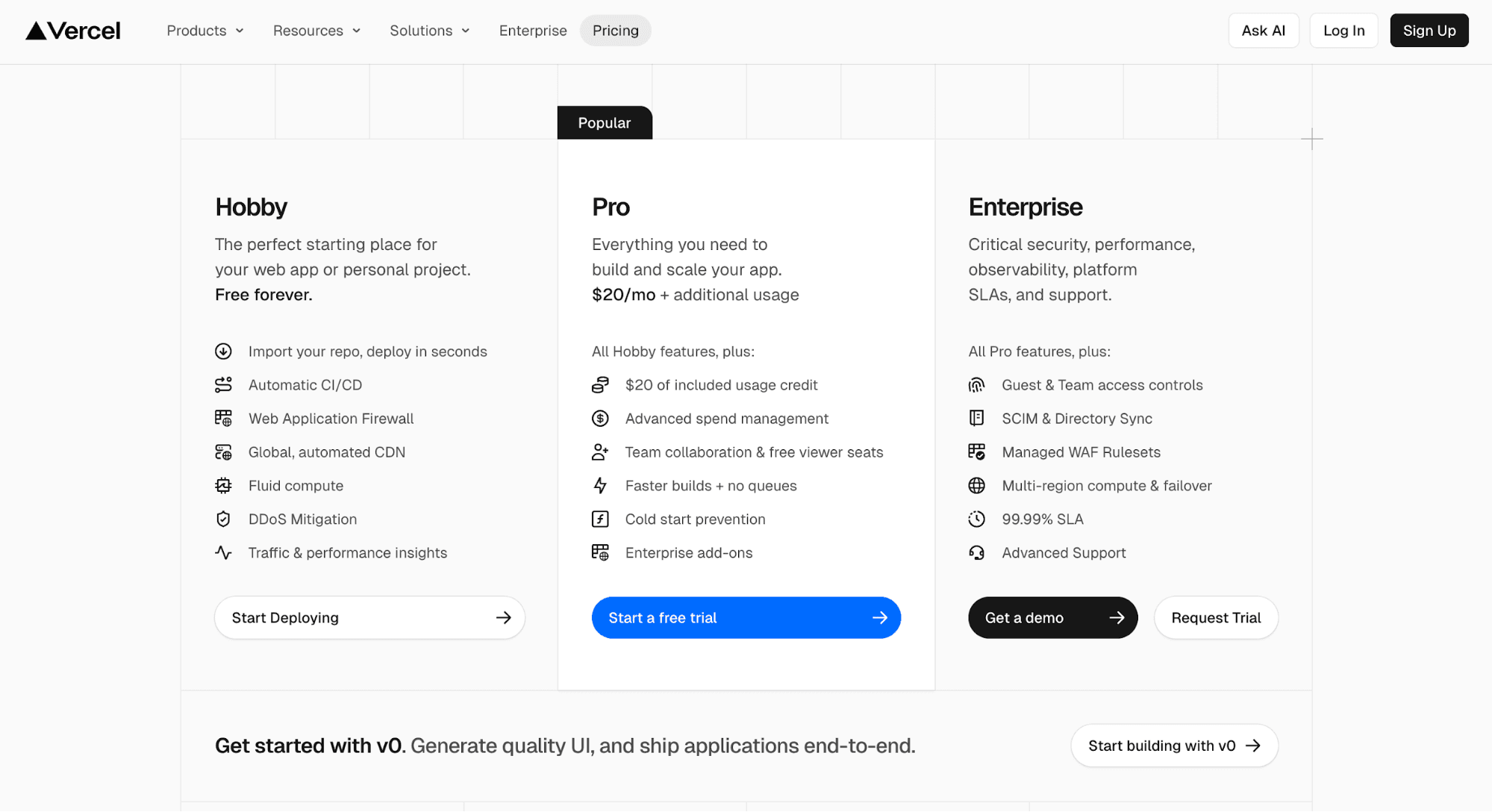
Source: Vercel.com
Vercel is a market-leading developer tool. It helps teams build, deploy, and scale web applications faster.
Vercel pricing follows a hybrid model. It combines a seat-based subscription plan with usage-based billing.
Its pricing page is relatively straightforward. It follows a simple three-tier structure (Hobby, Pro, and Enterprise) laid out in a clean, side-by-side comparison.
The top section is minimal. It highlights key features and includes short descriptions and clear CTAs tailored to different buyer personas. This makes it easy for developers to get started without overthinking.
However, Vercel's pricing structure becomes much more complex as you scroll down.
What starts simple gradually expands into a long, complex pricing page. It addresses more advanced use cases, features, and enterprise needs. This creates a dual experience: accessible for hobbyists and solo developers, but increasingly comprehensive for enterprise teams.
The page is designed to thread the needle between these audiences. It guides users from quick product understanding to deeper evaluation when needed.
Vercel also leans heavily on transparency. Instead of hiding pricing details, it provides extensive explanations, especially in its FAQ section.
The overall structure reflects a clear pricing strategy: start simple, then scale into depth. It supports hobbyists, teams, and enterprise buyers within a single, cohesive pricing page.
Below are the reasons why Vercel’s pricing page works so effectively:
Balances simplicity and depth
Highly transparent pricing with a detailed FAQ section
Supports multiple buyer personas (e.g., hobbyists, teams, and enterprise organizations)
Guides users from self-serve to enterprise
Confident product positioning
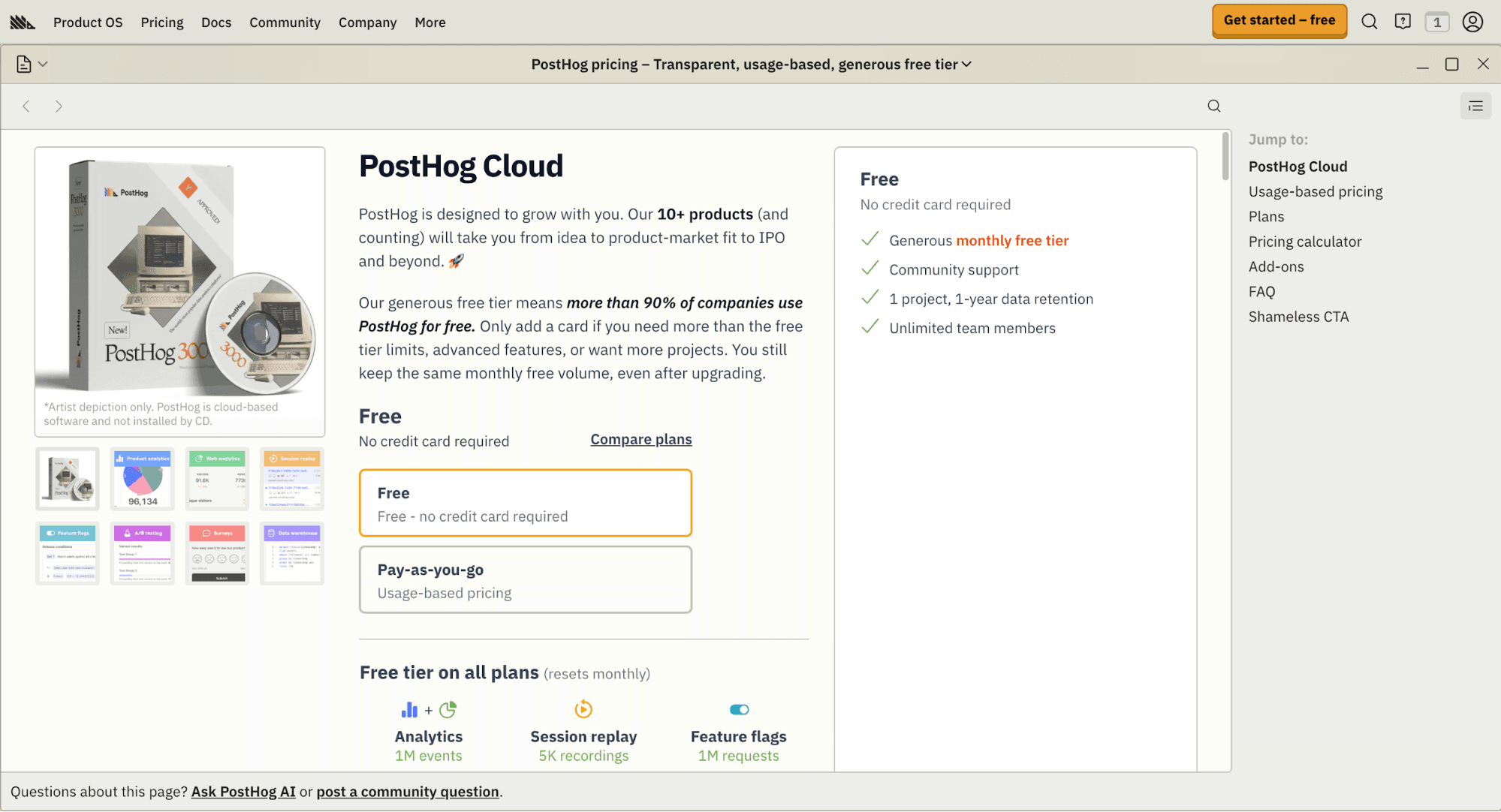
Source: PostHog.com
PostHog is an all-in-one developer tool that combines product analytics, session replay, and feature flags, among others.
It offers a free plan and a pay-as-you-go pricing model. Customers pay based on how much they use each product, not a fixed monthly plan.
Right off the bat, PostHog's pricing page design is very different from typical SaaS pricing pages. It looks like an e-commerce checkout page. There's social proof, impulse-driven CTAs, product images, and interactive elements that make it feel like you're shopping on Amazon.
Despite its unique design, PostHog still has the fundamentals of a pricing page. It has a clear plan section at the top, which removes decision friction. You start with a free account and pay overage fees when you exceed limits.
Usage-based fees are located just below the pricing plans. This makes it easy to understand costs at a granular level.
Another key part of the experience is the pricing calculator. You can estimate costs based on usage for each PostHog product.
Plus, a competitor comparison table shows why PostHog is the best choice.
Every aspect of PostHog's pricing page is an extension of its brand. It reflects their unique tone, humor, and transparency.
Here's what makes PostHog's pricing page effective:
Fun, unique pricing experience due to its e-commerce checkout page design
Fully transparent pricing with calculators to estimate costs
Removes decision friction
Reflects PostHog’s humorous tone and personality
Includes everything you need on a pricing page (e.g., tiers, FAQ, proposition value, social proof, competitor comparison, add-ons)
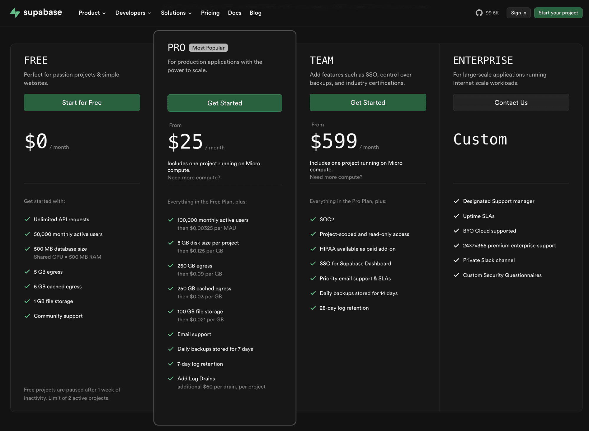
Source: Supabase.com
Supabase is an open-source backend platform that provides databases, authentication, storage, and edge functions.
It has a usage-based pricing model layered on top of simple tiers, where you pay for compute instances, storage, and bandwidth as you scale.
Supabase's pricing page follows a straightforward, developer-first layout. It starts with a tiered pricing structure: Free, Pro, Team, and Enterprise.
Each tier highlights key features, such as database size, file storage, and monthly active users (MAU). This layout makes it easy to scan different pricing plans and get started.
As you scroll down, the pricing page offers depth. It introduces usage-based pricing components like compute size, storage, and add-ons. Many features link to the documentation page for additional information.
The FAQ section is another effective element that guides users through pricing decisions.
Supabase follows a unique pricing strategy when it comes to compute. Instead of charging based only on utilization, it ties pricing to instance size and capacity. This makes costs more predictable.
Despite the complexity, Supabase's pricing page feels simple and approachable for both hobbyists and enterprises.
Supabase's pricing page is a masterclass in predictable pricing due to the following reasons:
Instance-based pricing with transparent overage policies
Robust cost control mechanisms
Linked docs and a detailed FAQ section
Transparent costs build long-term loyalty
Pricing as part of the user experience with the company
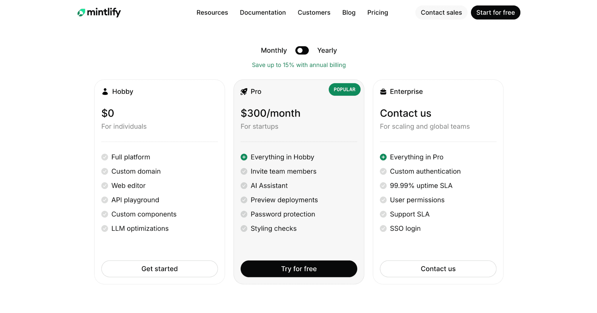
Source: Mintlify.com
Mintlify is a documentation platform for software companies. It helps developers create, manage, and host product docs with a strong focus on design and user experience.
The platform offers tiered subscription plans, Hobby, Pro, and Enterprise, that you can pay for monthly or annually.
Mintlify's pricing page looks clean and visually appealing. It reflects the platform’s design-first approach.
Plans are displayed side by side, with clear descriptions and a features list that make it easier to scan the page.
A pricing toggle for monthly and annual billing is located at the top. It's useful for comparing costs and seeing potential savings.
As you scroll down, the page introduces additional information about each plan. Features are grouped into sections, which helps you compare plans without clutter.
Mintlify's pricing page also includes strong social proof. Customer logos, visuals, and stories build trust and reinforce credibility.
The FAQ section at the bottom clearly answers common questions about pricing, free trials, and usage.
Below are the reasons why Mintlify's pricing page is effective:
Clean, developer-friendly design
Strong visual branding
Different types of social proof (e.g., logos and customer stories)
Accessible free tier to drive adoption
Displays pricing differences with a clear toggle and tiers
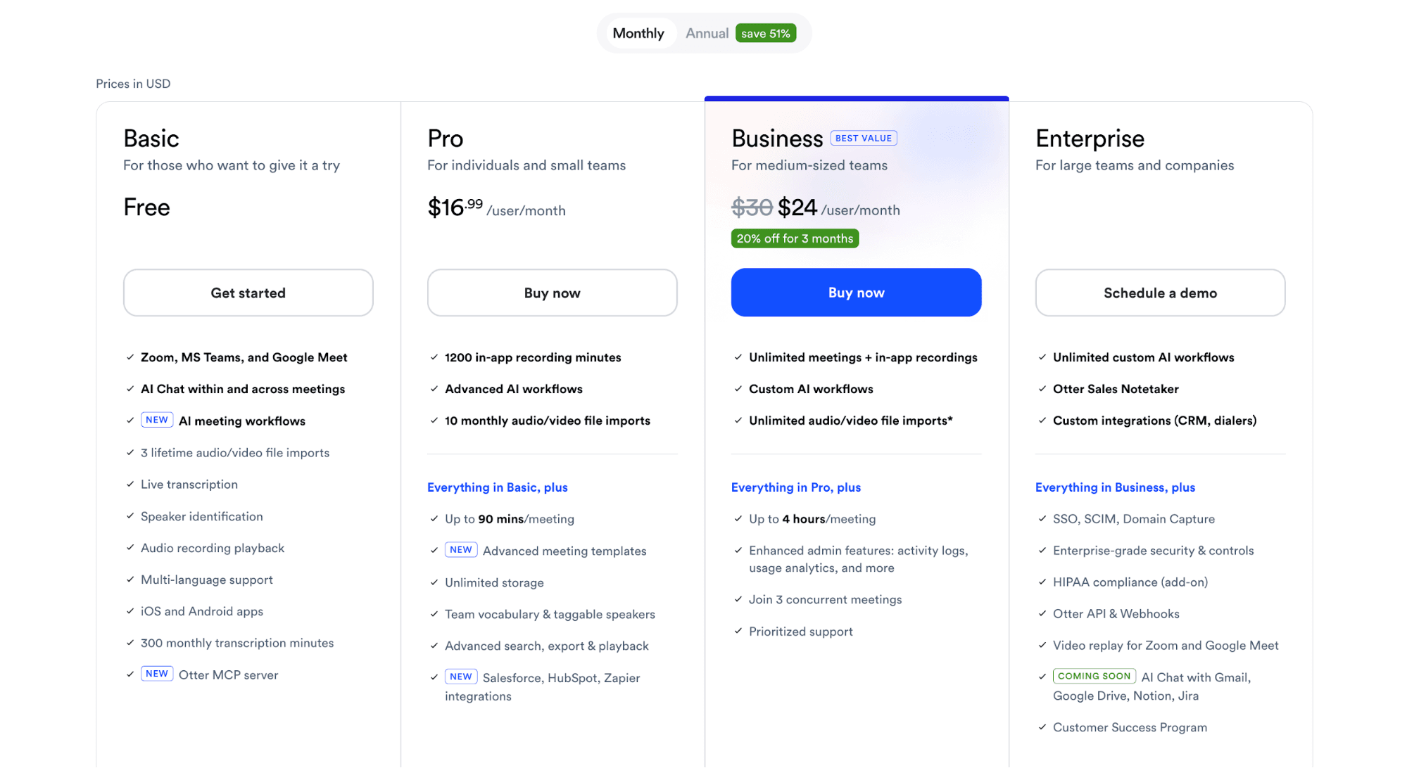
Source: Otter.ai
Otter.ai is an AI notetaker that transcribes meetings into knowledge bases, insights, notes, and summaries.
Otter.ai uses a tiered, per-user subscription pricing model that supports both product-led growth and sales-led motions.
Its pricing page is clean and structured for quick comparison. A pricing toggle at the top lets you switch between monthly and annual billing.
Below, you'll see the four main pricing plans: Basic (free), Pro, Business, and Enterprise. Each one highlights different features and key limitations, like transcription minutes and meeting duration.
Pricing tiers and features are displayed side by side in increasing value. The page guides users to see the "next level" as the natural upgrade path. For example, small organizations can start with Basic, then switch to Pro and Business as their business needs expand.
At the bottom, the short and sweet FAQ section answers common questions about Otter.ai's pricing. It reduces decision friction and handles objections effectively.
Here’s why Otter.ai’s pricing page works so well:
Keeps pricing simple and easy to understand
Makes upgrades feel natural as usage grows
Transparent feature-by-feature comparison and limits
Reduces decision friction
Uses a pricing toggle to show savings clearly
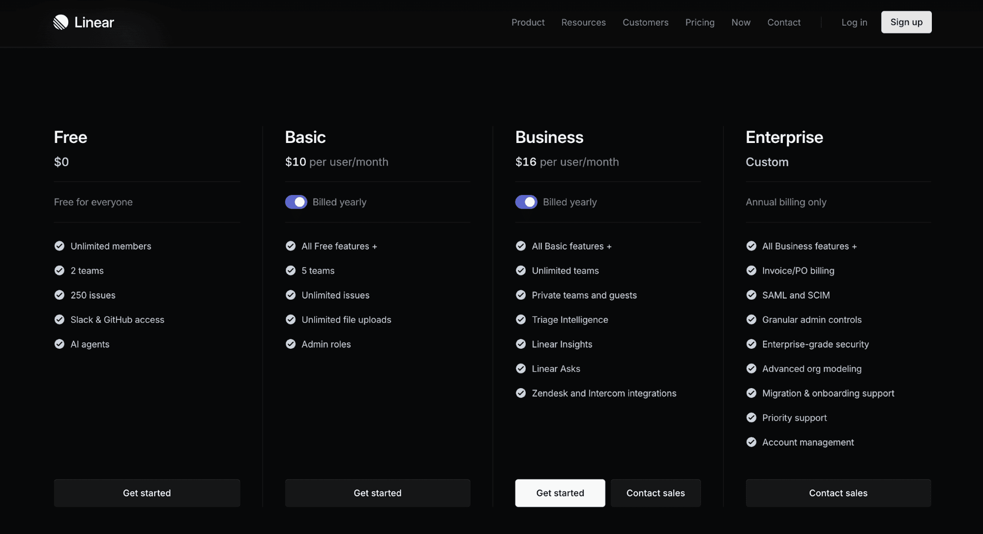
Source: Linear.app
Linear is a product development system and issue tracking tool. It's designed for speed and collaboration between humans and AI agents.
It uses a seat-based subscription model. A free plan is designed for hobbyists and early-stage startups, while three higher tiers cater to scaling businesses.
Linear's pricing page is very simple. You instantly know what you’re getting, what you’ll pay, and how to upgrade to a custom plan if needed.
Four subscription packages are shown side by side, and it's easy to get started with the first three tiers. There is also a clear "Contact Sales Team" CTA as businesses grow. This supports both self-serve and sales-led motion.
Each tier includes just enough detail upfront. Potential buyers can quickly understand the differences and choose the right plan without scrolling. The page signals early that this is not a complex decision-making process.
A comprehensive feature breakdown is located below the tiers to help users compare different plans.
The page also includes social proof with customer logos and links to customer stories.
One thing to note is that Linear's pricing page lacks an FAQ section. Still, it makes sense since their pricing is simple enough.
Linear's pricing page works due to several reasons:
Keeps pricing simple and easy to understand
Intuitive user experience
Low barrier to entry
Obvious upgrade paths between tiers
Introduces complexity gradually
Below are the common mistakes you should avoid when building your SaaS pricing page.
Too many plans - Excessive pricing options create confusion and slow purchasing decisions. Stick to no more than four tiers. Each plan should cater to a specific target audience.
Feature overload - Listing too many unique features overwhelms prospects. They stop reading and miss key differences. Focus on the most important features. Discuss details in a comparison table below the main tiers.
Hidden pricing information - Hiding costs builds distrust. Users want clarity upfront. Be transparent about costs, limits, and add-ons. Avoid forcing users to contact sales teams just to see pricing.
Poor mobile experience - Around 62% of website traffic comes from mobile devices. If your pricing page is hard to read or scroll on mobile, potential customers will leave. Use responsive design and keep layouts simple.
Lack of social proof - Without social proof, prospects hesitate to trust your product. Add logos, testimonials, or usage stats. This reassures users that others already use and value your SaaS product.
Static pricing - Pricing should not stay the same forever. If you never update it, you miss growth opportunities. Review and adjust pricing based on product value, market changes, and user behavior.
You need to update your SaaS pricing because your product, customers, and market evolve constantly.
As your product improves, your pricing should reflect that added value. For example, new features or better performance give you a reason to adjust pricing. If you keep the same pricing, you may undercharge and lose revenue.
Your target customers may also change. You might move from small teams to larger companies. This shift requires different plans, limits, and pricing structures.
Market conditions also play a role. Competitors change pricing, and customer expectations shift over time.
Pricing is not a one-time decision. It should evolve as your business grows and your SaaS product becomes more valuable.
Your SaaS pricing page will eventually need an update. The question is whether that change takes days or several months.
Schematic helps you launch any pricing model fast without rebuilding your billing stack. It's the monetization operating system that sits between your SaaS application and Stripe.
It serves as the system of record for your product catalog. Plans, software entitlements, limits, trials, credits, add-ons, and exceptions live in one place.
So instead of hard-coding pricing logic, you can update packaging and pricing in real time. Roll out pricing tests and feature access instantly without waiting on developers.
Engineering stops writing and maintaining billing code. Schematic evaluates and enforces access in-product at runtime.
Product and GTM teams can continuously iterate on monetization.
An effective SaaS pricing page includes a value-driven headline, clear pricing plans, feature comparisons, social proof, and an FAQ section. A competitor comparison is a bonus element that can help potential customers evaluate options without leaving your SaaS website.
The best SaaS pricing page layout is simple and structured. Start with a value-driven headline, followed by three to four pricing tiers organized horizontally. Use a toggle for monthly and annual pricing if applicable. Add a feature comparison below for more detail. Include social proof throughout the page to build trust. Finally, place FAQs at the bottom. This layout helps users scan, compare, and decide faster.
You need to update your pricing page because your product, paying customers, and pricing strategy change over time. As you add new features or target new segments, your current pricing may no longer fit. If you don’t update it, you risk underpricing or slowing growth. Regular updates keep your pricing aligned with value and business goals.
