The more I do this, the more I realize that the key to building truly buttery products (using Nick Grossman’s definition of the word) is building up the patience, confidence, and earned insight to chisel it down. Reduce and simplify. Then do it again.One of the hardest things to do when designing a product is removing what's not strictly necessary. Fewer steps in the flow, fewer affordances, fewer concepts in your mental model, fewer words, fewer of everything that isn't the valuable part.It's a natural instinct as a builder to not want to throw away your work. You spent a lot of time finding an elegant solution - the perfect design, the perfect architecture. Even so, you will have to chisel it down. I've worked with very few product designers and engineers that have a strong desire to simplify the product they're building. Usually, the instinct and the pressure is to just add more functionality - and the focus is often on design systems and components that make it easy to throw in more flows, affordances, etc.

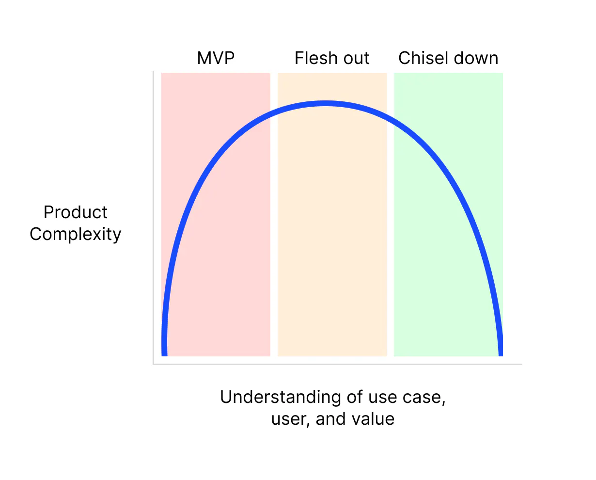
I think our reluctance to chisel down our products comes from insecurity.Simplicity comes from having the bravery to remove what's not strictly necessary. That bravery comes from something.Personally, I only get brave after spending the time to deeply understand how the product will be used — who is using this? Why is it valuable to them? What terminology and mental models are they familiar with? Only then is it clear what is fat to cut and what is value to uphold and build upon.Interestingly, simplicity can also come from ignorance. At first, when you don’t know much at all about the problem space and you haven’t built anything, you have to design something simple. You have to start somewhere.Then you get feedback, learn more about the user, gather requirements, and imagine the future. The product gets more complex. The old simple solution just wasn’t valuable enough. It’s time to flesh it out. More of everything.
This isn’t wrong; this is normal. But many builders remain here. They’re under pressure to add more functionality, and soon the product is far from buttery. It starts to feel bloated, complex, and over-encumbered.
We’re familiar with this lifecycle, and many of us have seen our favorite products lose their butteriness and instead become expensive, complicated behemoths as they capture more markets and sell to larger companies. This makes sense too — serving more people and providing more value is good.But some products choose another way. They choose to chisel down, and they make that practice a core part of how they build.

There are many examples of these products, a few that stood out to me recently:
Linear
Typeform
Todoist
Medium’s text editor
Superhuman
Arc
The best products manage to do a lot while feeling simple, focused, and uncluttered. But it takes the discipline, patience, and earned insight to chisel the product down.Being opinionated unlocks the bravery to make things simple. A strong opinion is earned by talking to customers, solving your own problem, and understanding status quo tools and mental models.If you’re feeling reluctant or unable to simplify, consider whether you understand the problem you’re solving or the person you’re building for well enough.
What does chiseling down actually look like? For me, it’s been:
A few extra design cycles with the express goal of reducing and simplifying
This is often painful for the designer because after they’ve finally solved the puzzle of jamming every affordance onto the screen, they now have to chisel it down.
Chiseling down is by far the cheapest at the design and definition phase. Buttery products don’t just tack on a new feature; they find a way to add it seamlessly.
Only build things that are core to what is valuable about your product.
If a feature isn’t getting adopted, it’s not useful. Delete it. Chances are no one will complain. Learn from anyone who does complain.
Don’t optimize for the loud minority. Your biggest fans and power users can teach you a lot by asking why and ignoring their ideas for solutions.
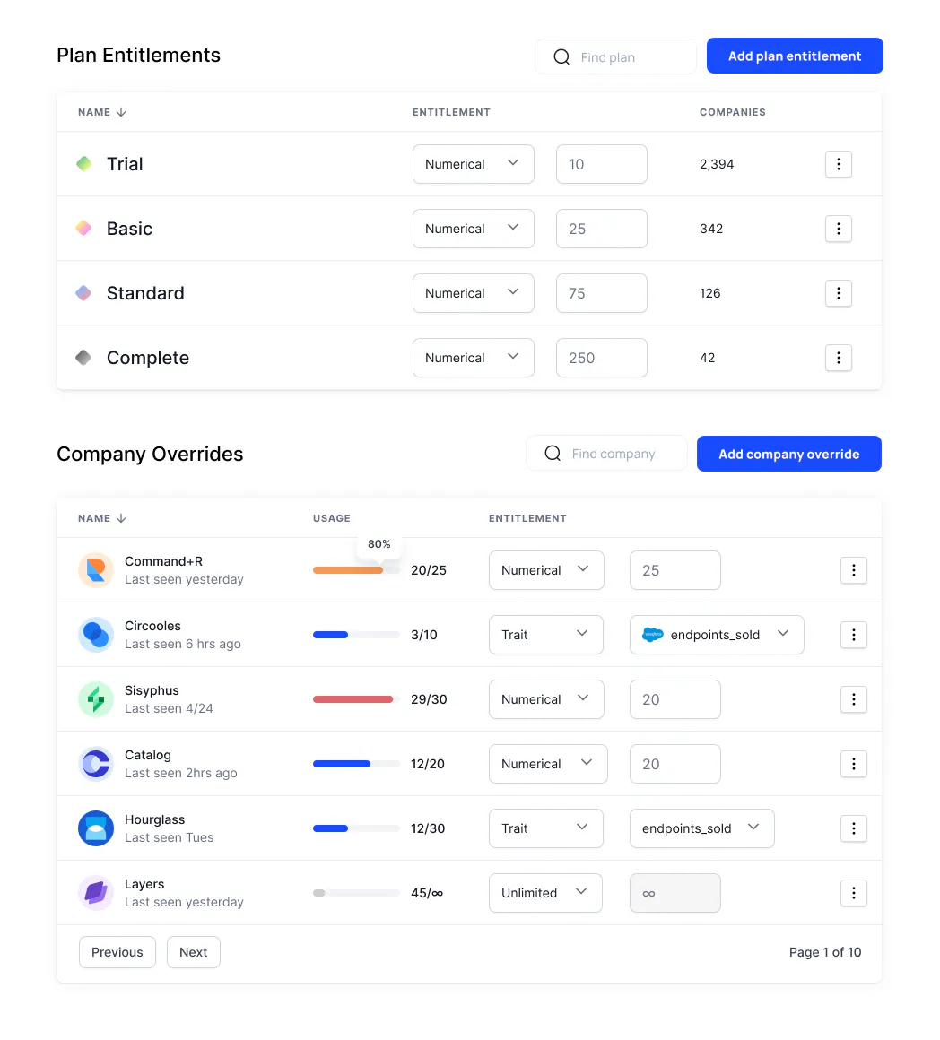
At Schematic, we're trying to build a simple to use entitlements platform that can support any saas company's pricing, packaging, and overall feature management needs.We needed a UX for editing an entitlement that is simple to understand and flexible enough to handle a lot of states and configurations.The first iteration was inline which felt convenient and natural to understanding "what is in this plan?" Here's an example for a feature called Seats. 10 seats are available on the trial plan, etc...

This needs chiseling down.If we take another pass and think about how this will actually get used, it's clear that this approach is too complicated.
Since entitlements are actually relationships, the UI to edit them has to exist on both objects (ie feature and plan). But each object would need its own UI for inline editing.
Creating an entitlement requires building a popup or a row addition UX - more UI surface area, awkward to edit fields in a cramped space
An entitlement is actually an object and over time will house more configuration and metadata. There is no way to do that in this approach without an additional detail view.
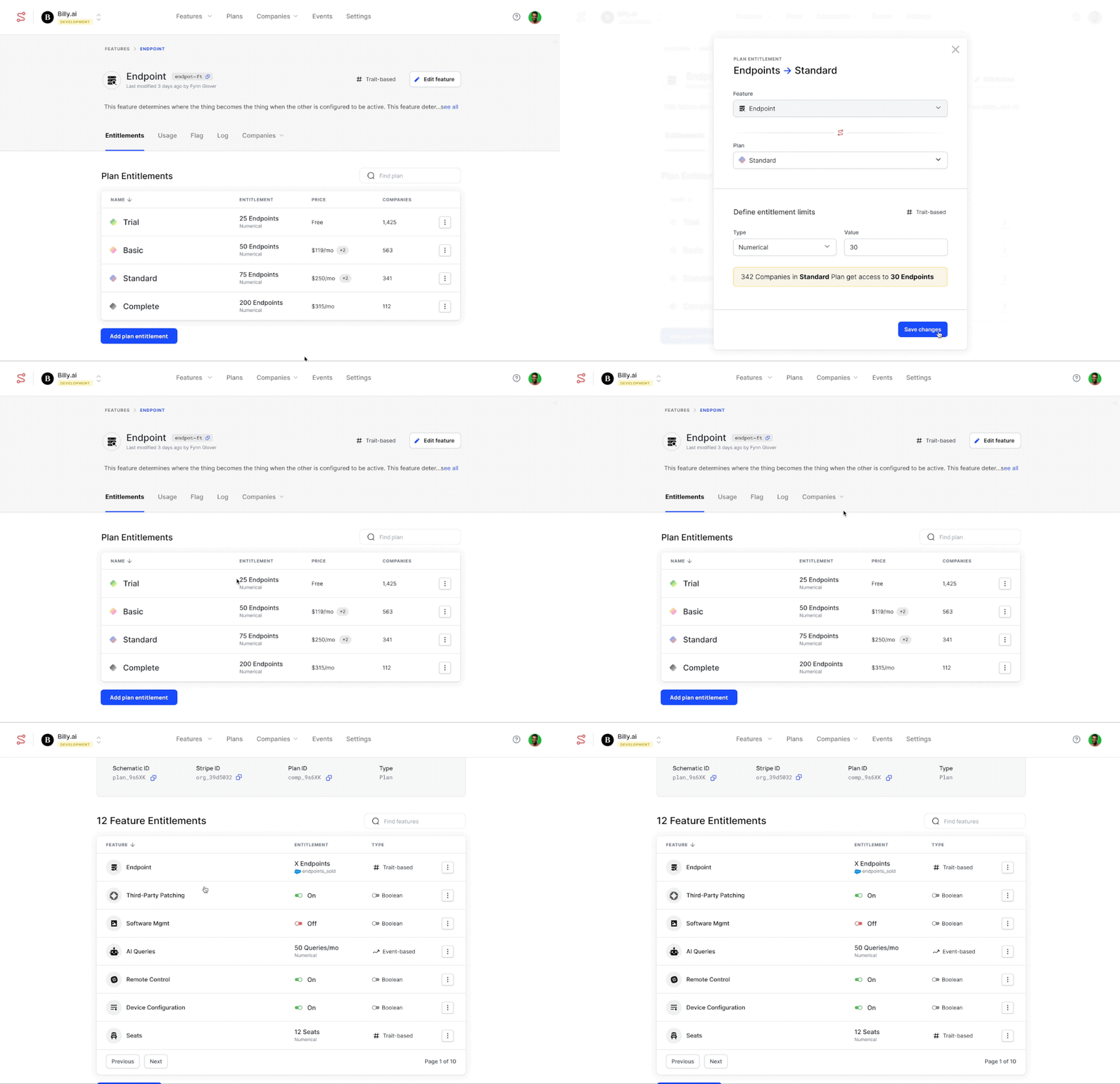
Making this work requires a lot more complexity than it initially appeared. The chisel pass yielded a simpler approach where each object has a read only table that opens a shared entitlement detail view. Fewer objects, fewer clicks, more flexibility, less UI to build, test, and maintain. Chiseled down.

As builders, we’re always pushing ourselves to learn the new framework, the new tooling, the new prompt. We’re conditioned to add to our skillset, learn more industries, and tackle more problems.But we also have to push ourselves to be discerning and confident enough to remove the cruft. Even though it feels subtractive, it’s ultimately additive. Ask yourself: when’s the last time I spent a cycle chiseling down instead of building up?